Overview
In 2019, T. Rowe Price set out to redesign and rebuild their native Android and iOS mobile applications. The original app was built without a design process and without any designers. Over the years, functionality was added well beyond the original intent, leaving the apps overdue for a redesign, all while new features continued to be introduced to the experience.
My role
I took over as design lead on the project in June 2020, responsible for all of the mobile app designs across iOS, Android, and iPadOS.
Navigation, visuals, and patterns rebuilt for each OS
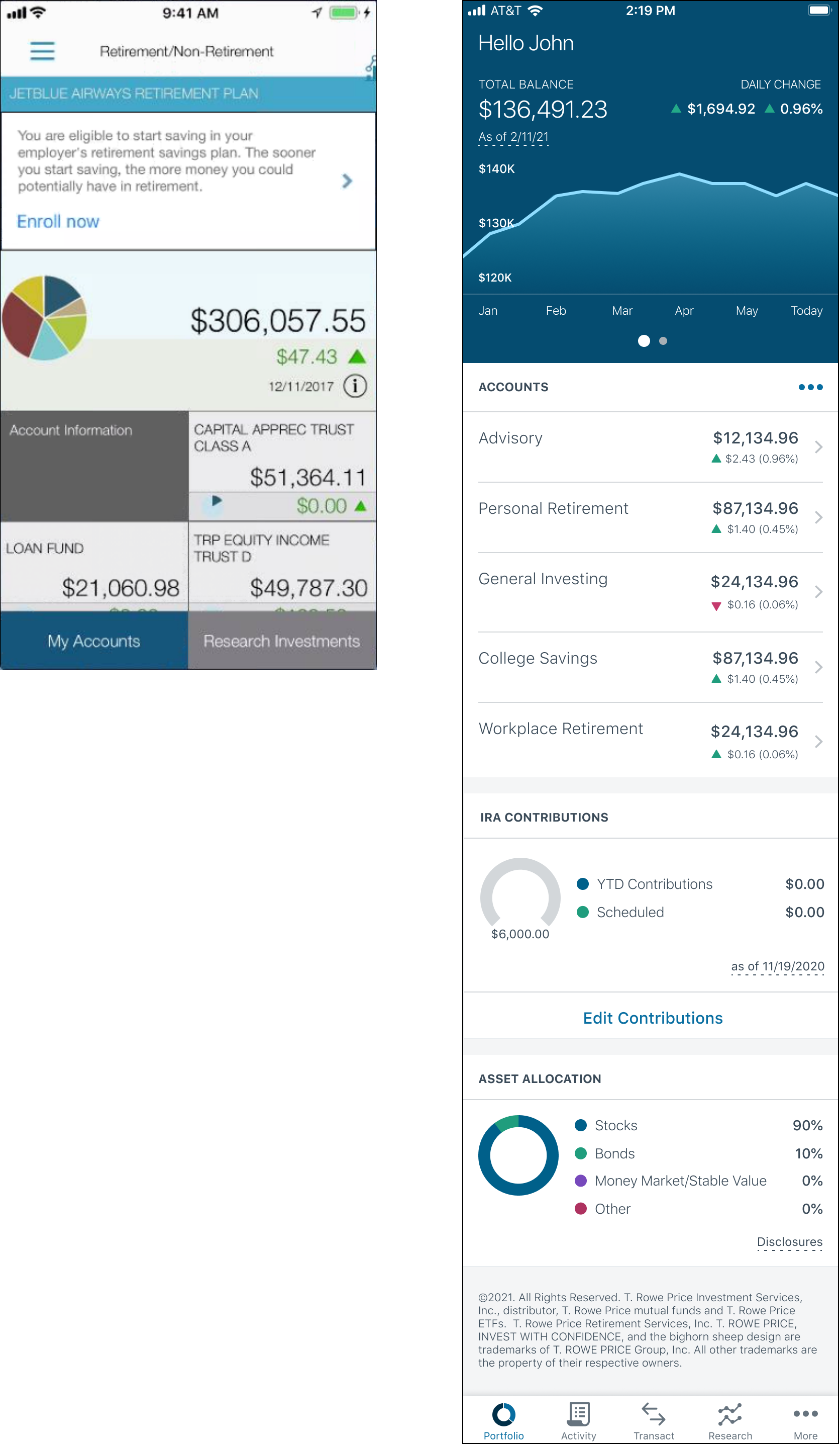
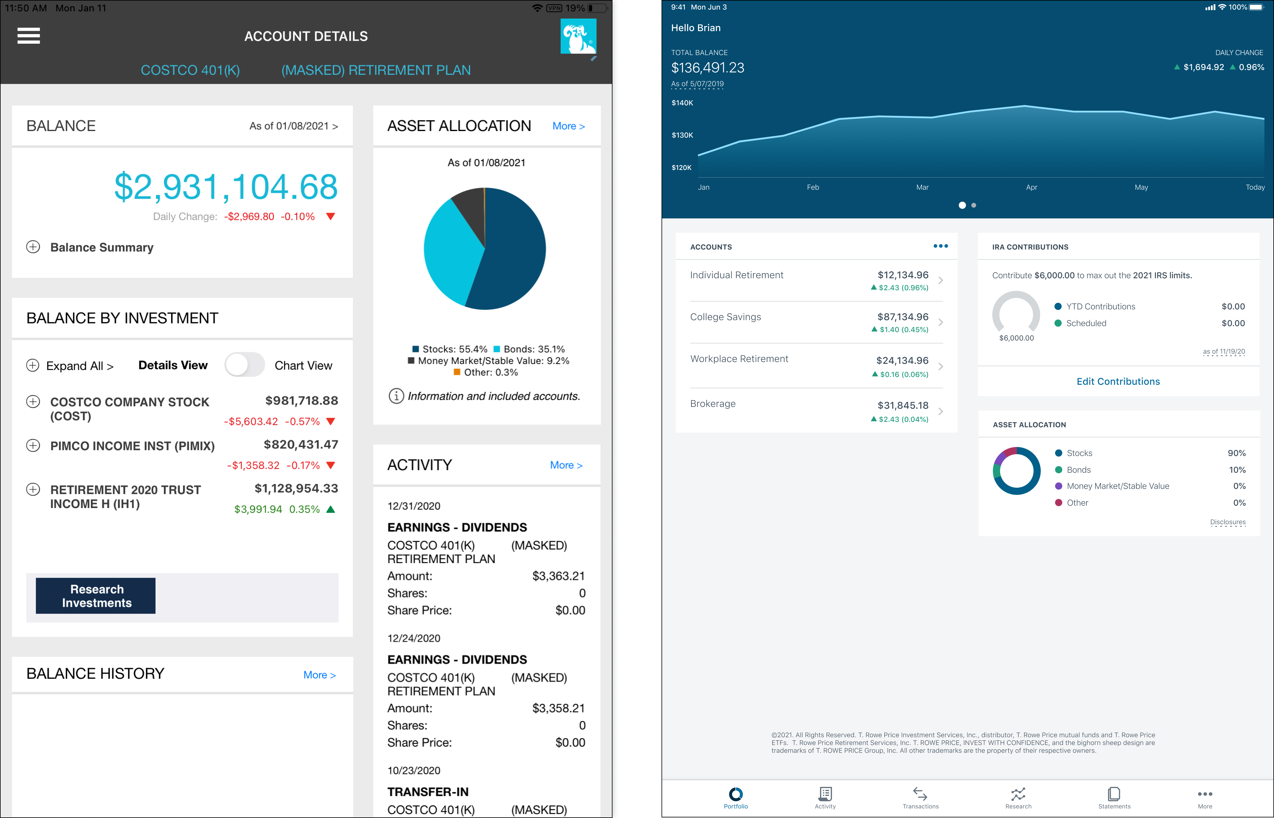
Modernization focused on three core pillars: navigation & UI, visual design, and OS-native design patterns. The navigation was redesigned on both platforms, while the visual design was refreshed through T. Rowe Price’s enterprise design system, ensuring cohesion across products and platforms. Interactions were enhanced to align with user expectations on each platform, and on iOS the app moved to a universal app to enable rapid iteration on the iPad experience.
Tables that fit more data on a small screen
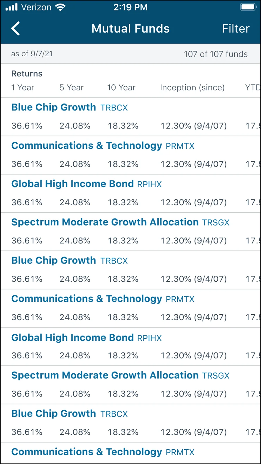
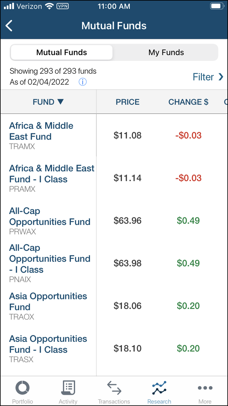
Many experiential enhancements have been made throughout the app. One such example is the mutual funds research tool - a large table that contains data for over 150 mutual funds. The previous iteration limited the amount of data shown, reducing its value compared to the comprehensive experience on the website.
I created a new approach to tables that allowed more data to be presented. The locked first column of the original table was replaced with a horizontally-locked, tappable label at the top of each row, letting users scroll horizontally to view fund details without losing context. This also reduced row height, improving users’ ability to compare multiple funds at once.
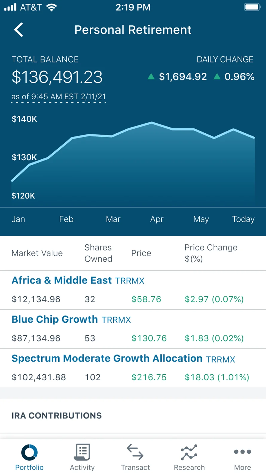
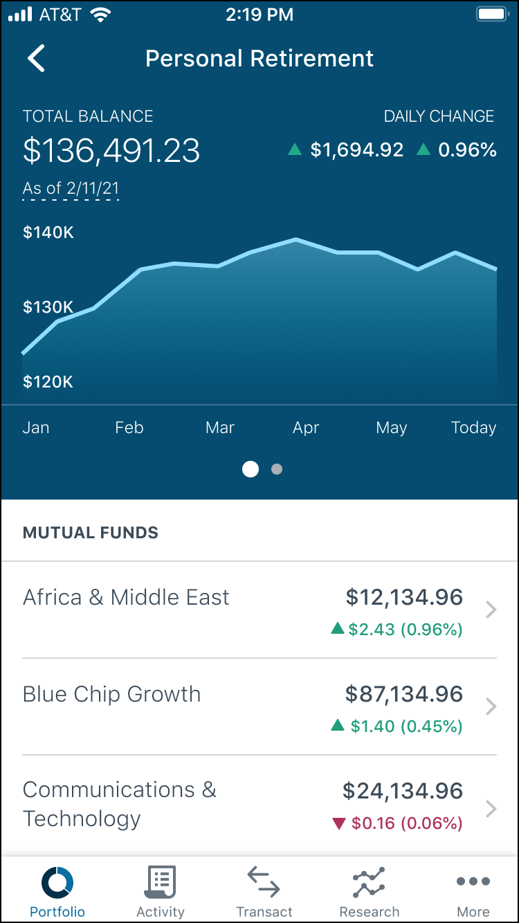
This table style was also applied to the portfolio section. Previously, users had to tap into each fund to view details in standalone screens which required users to navigate back and forth to understand a full account. The updated tables give a comprehensive view of an account in one place. Horizontally scrolling data lets users see every fund’s performance together, reducing cognitive load.
More transactions available in the app
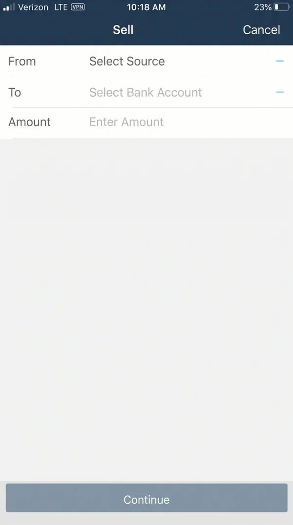
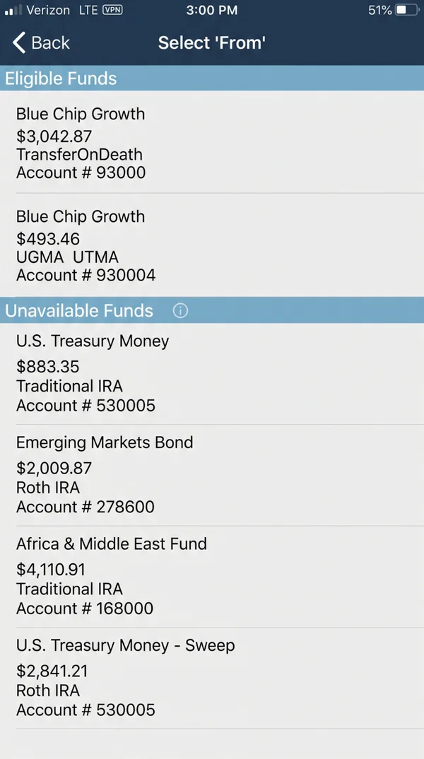
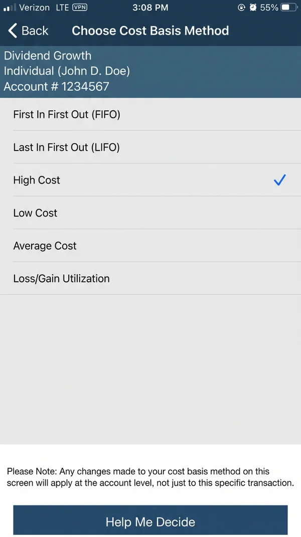
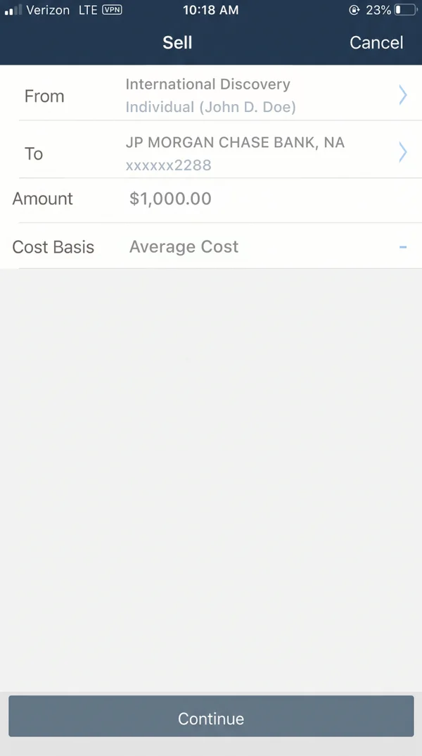
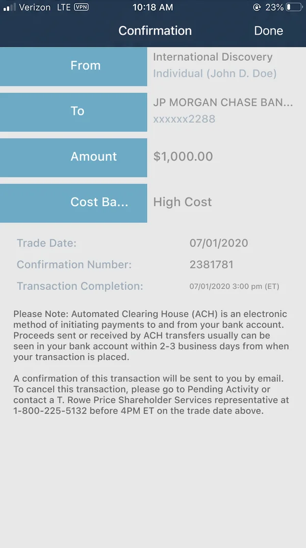
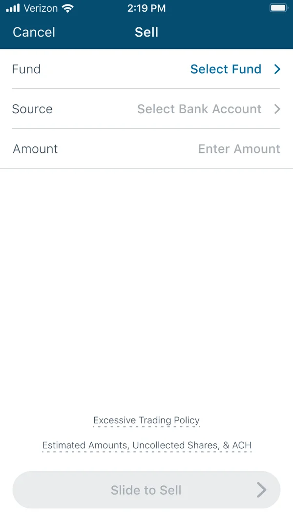
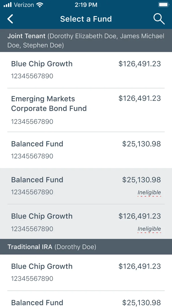
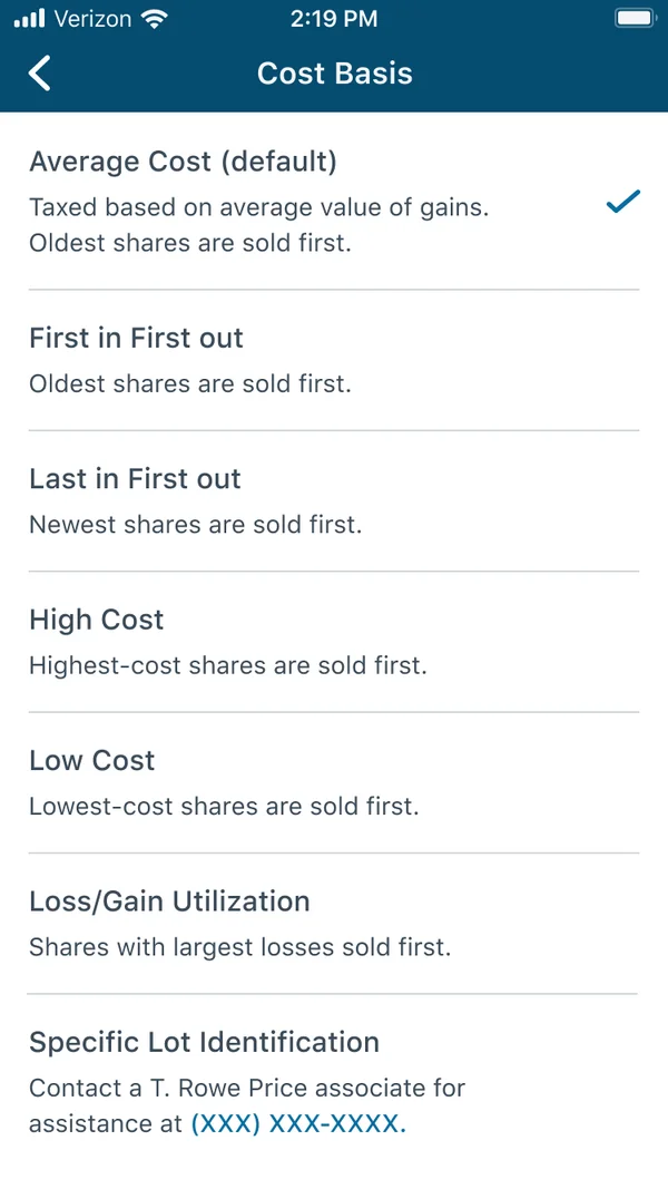
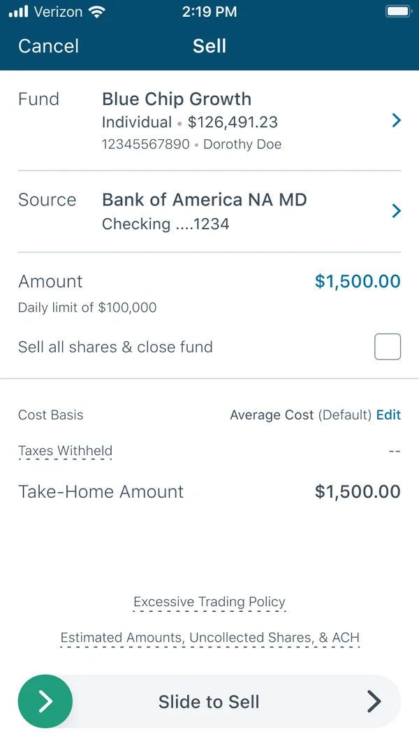
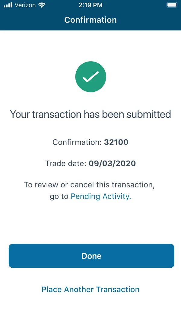
Second only to portfolio monitoring, transaction flows are the most important function of the apps. Only a handful of the website’s flows were available in the app, featuring unintuitive patterns and out-of-date designs that failed accessibility checks.
I redesigned the existing flows to utilize the enterprise design system with interaction patterns users would be more familiar with. Then I leveraged those patterns to build new flows, closing feature gaps between the apps and the website.
Results
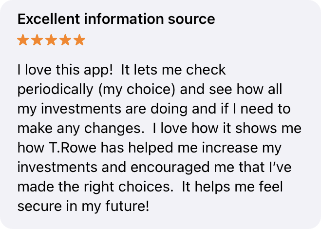
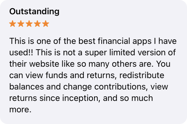
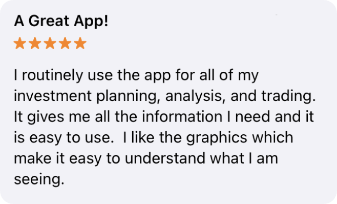
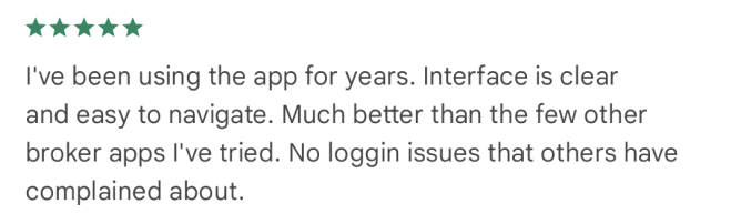
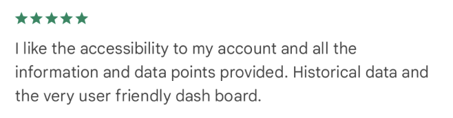
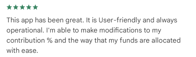
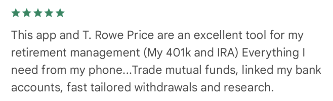
Since the redesign, the mobile app has seen significant growth in unique users and visits while App Store ratings have climbed.
Jan–Jul