Overview
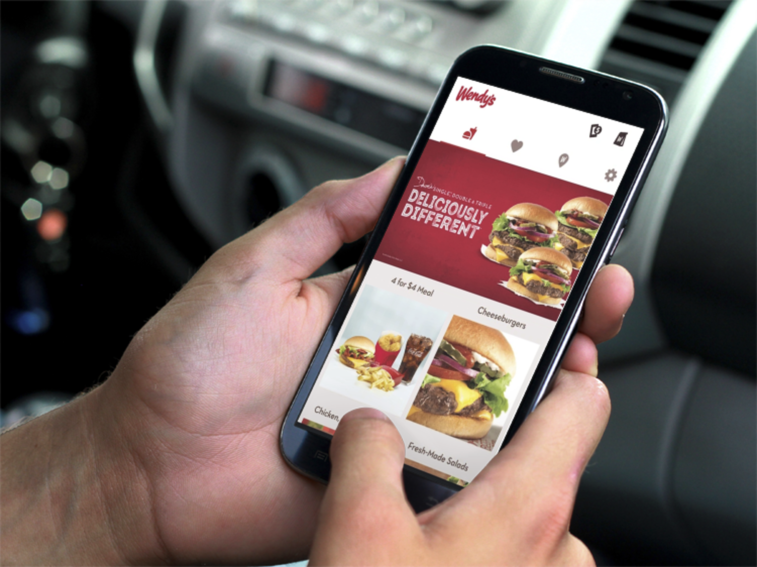
The Wendy's Company had a fragmented mobile strategy split across three separate applications, each handling a piece of the experience. With 12 million customers served annually, Wendy’s wanted to elevate their mobile presence to a single premier product for ordering and rewards that could help the company remain competitive against increasingly popular fast casual chains like Chipotle and Shake Shack.
The Challenge
Three problems shaped the work from the outset. The first was diagnostic: I had to understand exactly where the three previous Wendy's mobile experiences were failing users, then turn that audit into a clear direction that a single new app could build on.
The second was focused on operational and product logic. I had to uncover all of the flows for scenarios like when mobile orders appeared in the queue at the restaurant or how orders were queued in the store based on whether they were pickup, delivery, or carry out orders. I also had to work with the Wendy’s team to determine granular customization options like “just how many pieces of bacon should customers be able to add to a baconator?”
The third challenge was political. My agency was brought in to lead the design work, but we had engineers of our own and wanted to take over the development work as well. A second agency was brought in to handle engineering, but they had designers and wanted the design work. So the two teams had to collaborate closely on a single app while quietly competing to become the Wendy’s agency of record.
My Role & Team
I was the UX lead for the project, responsible for the discovery process, the wireframing, and prototyping. I followed a paired-design process with a Visual Design lead who was focused on creating a new design system. Sketching, prototyping, and designing happened collaboratively so the wireframes and the visual system evolved in lockstep. As the design system evolved, we turned the wireframes into fully designed comps.
Beyond my team, I drew on subject-matter experts at Wendy's HQ who grounded the design in the operational realities of meal ordering, and the competing agency.
Design Thinking
The approach was deliberately discovery-heavy with an intensive research phase of design thinking workshops and in-store user research anchoring every decision that followed. The project kicked off with a multi-day workshop at Wendy's HQ with stakeholders across the company to identify new features and value-add opportunities.
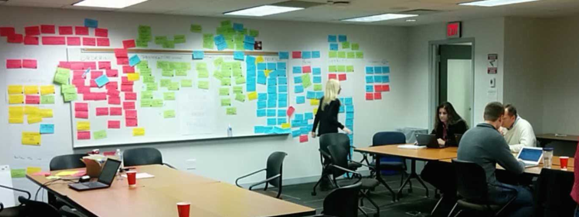
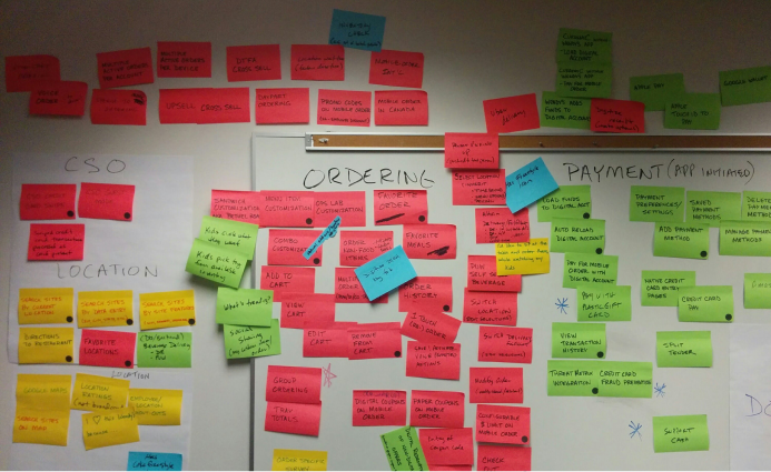
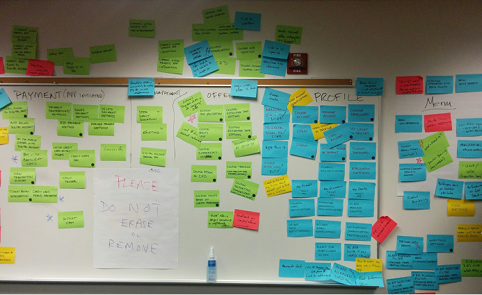
Next, I traveled to various restaurants to conduct customer interviews and perform usability testing of the original mobile applications to provide an audit of what was and was not working.
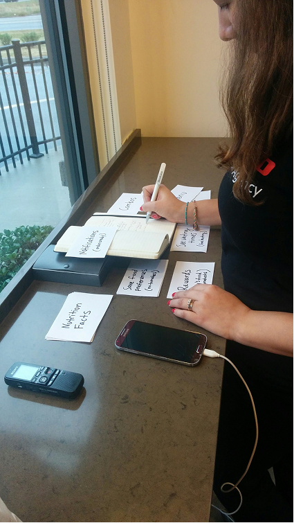
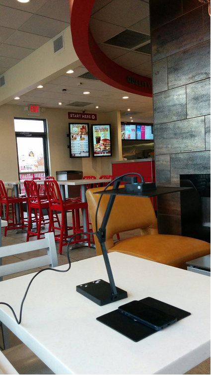
This initial discovery phase wrapped up with detailed stakeholder interviews focused on providing a deep understanding of the meal ordering operations and system integration points.
Sketching
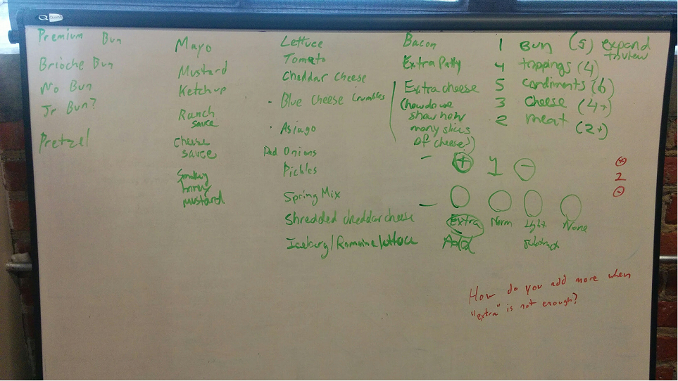
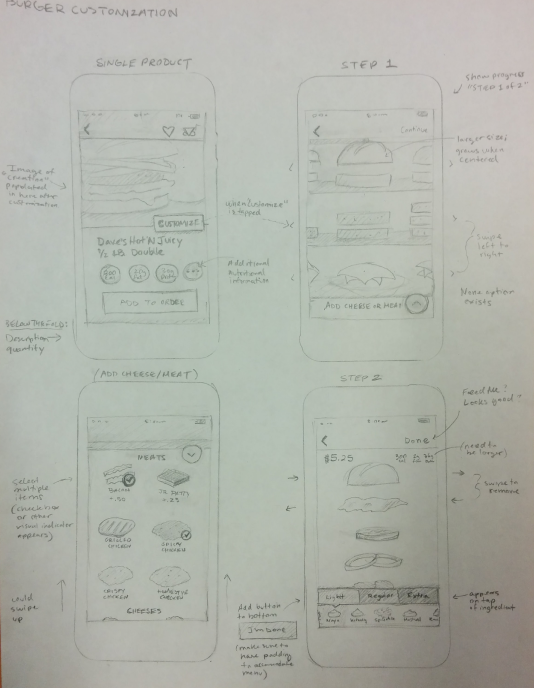
The UX design phase began with in-depth collaborative brainstorming and sketching. Sketching was done to map out information architecture and refine individual requirements for features, such as the burger customizer.
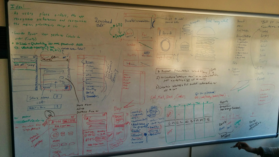
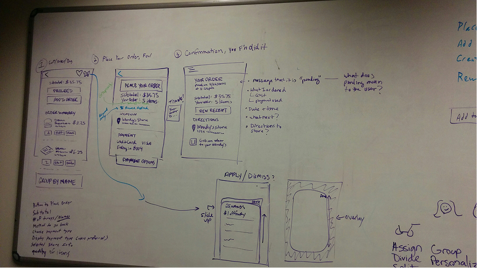
Comprehensive Wireframes
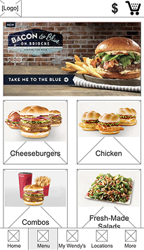
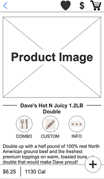
The design phase continued with wireframing the entire experience while the visual design lead worked on the new design system for the application. As the wireframes and design system were defined and refined, the wires were elevated to fully designed comps before moving over to development.
Applying the Design System
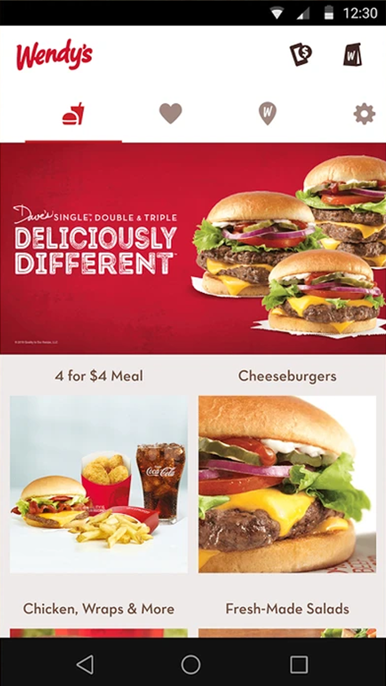
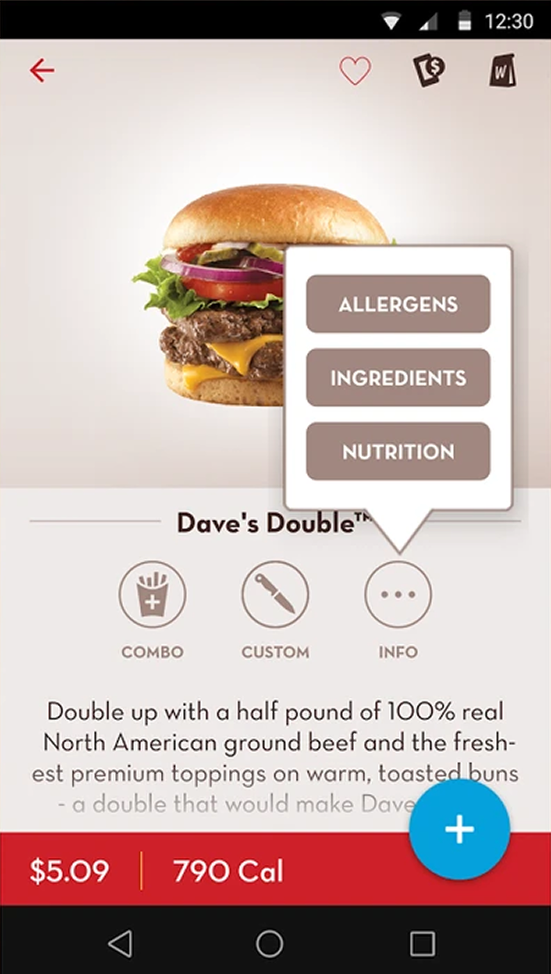
With the wireframes validated and the new design system taking shape, the final phase was translating those flows into a polished, production-ready product, applying the design system's components, color, and typography to bring the experience to life.
Results
The fragmented, unintuitive experiences became a single mobile application for iOS and Android that customers genuinely enjoyed using. The three apps merged into one holistic product where people could place customized orders, find locations, gain rewards, and manage payment options.
The impact reached beyond the app itself. The Wendy's team was so confident in the output of the discovery and design process that my agency ultimately took over the development work as well.
“This app works really well. Whoever thought this app through understands the consumer fairly well.”